We’re seeing continual growth in the use of the ThousandEyes platform in Network Operations Centers (NOCs). When you step into a NOC of any size, the first thing you notice is the variety of displays positioned all around the office. With large screens on the wall and multiple monitors on every desk, operators in NOCs always strive to display as much relevant information as possible on the screens in front of them, ideally with little to no interaction from the operator.
NOCs with internal development teams use our API extensively. They poll test and alert data, process it with an internal application and aggregate and display the data on their screens. However, we are also getting more and more requests from small to medium-sized NOCs that are looking for a solution that puts relevant data directly on their screens with little to no development on their end. Recently, we took the first steps toward this solution with the introduction of embedded widgets, which allow you to display key up-to-the-minute metrics on a custom dashboard. In this post, we’ll explore our continued efforts with two new NOC-friendly features that maximize the use of screen real estate: the box and whiskers report widget and the widget carousel.
Box and Whiskers Widget
Joining our wide variety of report widgets is the box and whiskers widget. Box and whiskers charts excel at presenting a large amount of meaningful data on a single widget, combining statistical functions that would typically be graphed on a number of different charts. Sound dull? Let me present you with an example.
Below is a typical line graph that displays the median value of Mean Opinion Score (MOS), a metric that represents the quality of a voice session over time.

MOS is measured for multiple network connections carrying voice traffic between offices, and is aggregated here as a single median MOS value. NOC operators are very concerned that the MOS does not drop under 4.0, a value that reflects a good voice connection. Based on this graph, they had no problems with this metric over this time period.
Or did they? Fortunately, the NOC operators set up another chart that displays the minimum value of the same MOS metric.

the quality of the voice connection also ranged widely.
This chart shows a very different picture. Minimum MOS values are scattered all over the y axis, implying that the voice connection ranged from good to bad — a condition which would no doubt be noticed by voice users long before the NOC would react to it.
The fact is, neither of these two charts shows the real impact of network connection quality on voice traffic, as the average, median, maximum and minimum values don’t tell you much about the distribution of these metrics, and they certainly don’t reflect the actual quality of the voice connection in a quick and easy-to-read chart.
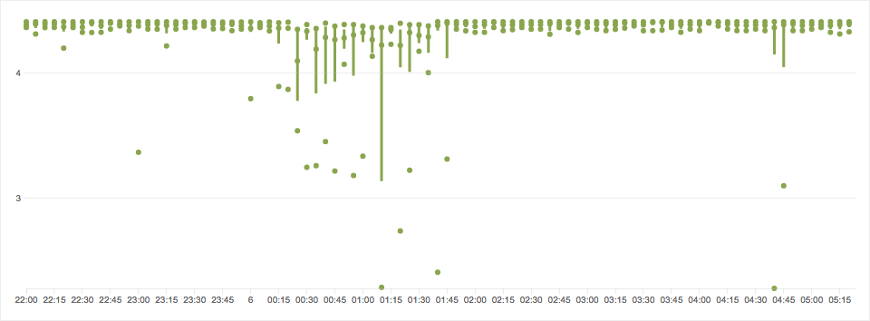
Take a look at the same data displayed in a box and whiskers chart:

The distribution of samples is very obvious even on first sight. While the majority of voice tests returned a MOS of around 4.35, ensuring good voice quality for the majority of users, there were regular occurrences of MOS values that indicated poor voice quality.
While the visual distribution of graphical elements alone provides a wealth of data on first sight, the box and whiskers chart also represents insightful statistical values.

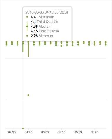
The dot in the middle represents the median value for a given time period. The upper and lower dots are the “whiskers,” which represent the maximum and minimum values. The “box” expands from the median value upward to the third quartile and downward to the first quartile. The height of the box represents the middle 50% interval of all values.
In this specific time slice, though the minimum MOS measured was only 2.28, indicating a bad voice quality, 75% of the measured MOS samples were above 4.15, indicating a good voice quality for the majority of users in this period.
Widget Carousel
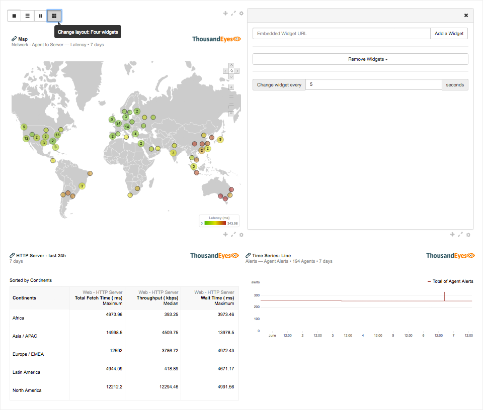
Another way to optimize the density of information on dashboards is to use layouts and cycle through widgets using embedded widgets in widget carousels. Embedded widgets are very easy to embed into any HTML document — simply insert the iframe code provided by ThousandEyes. A number of our customers have successfully integrated embedded widgets into their large format displays.
Still, we frequently get requests for recommendations and code snippets on how to use embedded widgets on large format screens, position them in different layouts and cycle through displaying multiple widgets.
We have merged all of the requests and code snippets we’ve shared with our customers in an open source widget carousel template. The widget carousel template is a simple HTML file that utilizes open source libraries to display embedded widgets on your large format screen. It currently allows embedded widgets to be displayed in four different types of screen layouts. Once widgets have been added to a screen layout, you can drag the widgets to other positions, populate a position with multiple widgets to automatically cycle through widgets, and change the cycle timers, among other actions. Check out the readme file for details.

All of the code for the widget carousel is contained in the HTML file, with settings stored locally in the browser. This makes it easy to deploy anywhere in your environment. It doesn’t require any authentication and can be used on your display without any user interaction past the initial configuration. We have published the code on our GitHub — we invite you to fork the repository and modify the code to fit your particular needs. If you find a bug or make significant improvements, we invite you to share it with the community by sending us a pull request!
Not only is raw network data important to operators, but the visualization and display of this data is also crucial to understanding and detecting key performance trends. The new box and whiskers report widget, together with the widget carousel template, can greatly help NOC teams optimize the density of relevant information on their dashboard screens with little to no development required.


